Interactive Museum Exhibits on a Realistic Budget: A Planning Guide

How curators and exhibition teams plan interactive exhibits when the budget is real: prioritizing interactions, phasing hardware, and where factories fit.
Start From the Interpretation Plan, Not the Catalog
The most cost-effective interactive exhibits are the ones that carry a curatorial message. List the three stories your exhibition must tell, then match the cheapest interaction that delivers each one: a floor response for ecosystems, a wall timeline for history, a single sensing station for hands-on depth.
The Value Ranking (From Experience)
- Interactive floor: highest engagement per dollar — one unit, no touchscreens, all ages
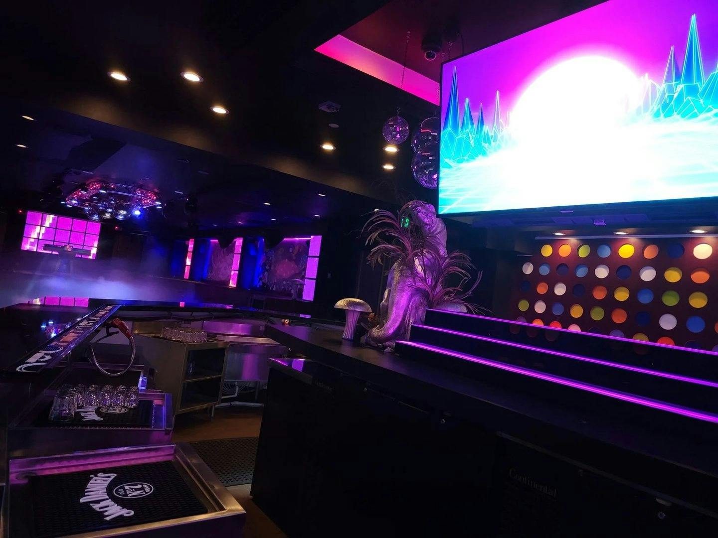
- Reactive wall scenes: sets the room's tone and carries the theme
- One hero station: a single deeper interactive (radar-triggered scene, holographic showcase) as the signature moment
Phase the Build
Museums rarely need everything on opening day. Phase one: one floor unit and one wall scene. Phase two, funded by foot-traffic data: extend to the full gallery. Because all-in-one systems fuse over network cable, expansion is plug-and-play — no re-design.
Where the Money Leaks
- Custom PC builds per exhibit — all-in-ones eliminate them
- Content produced before the canvas size is fixed
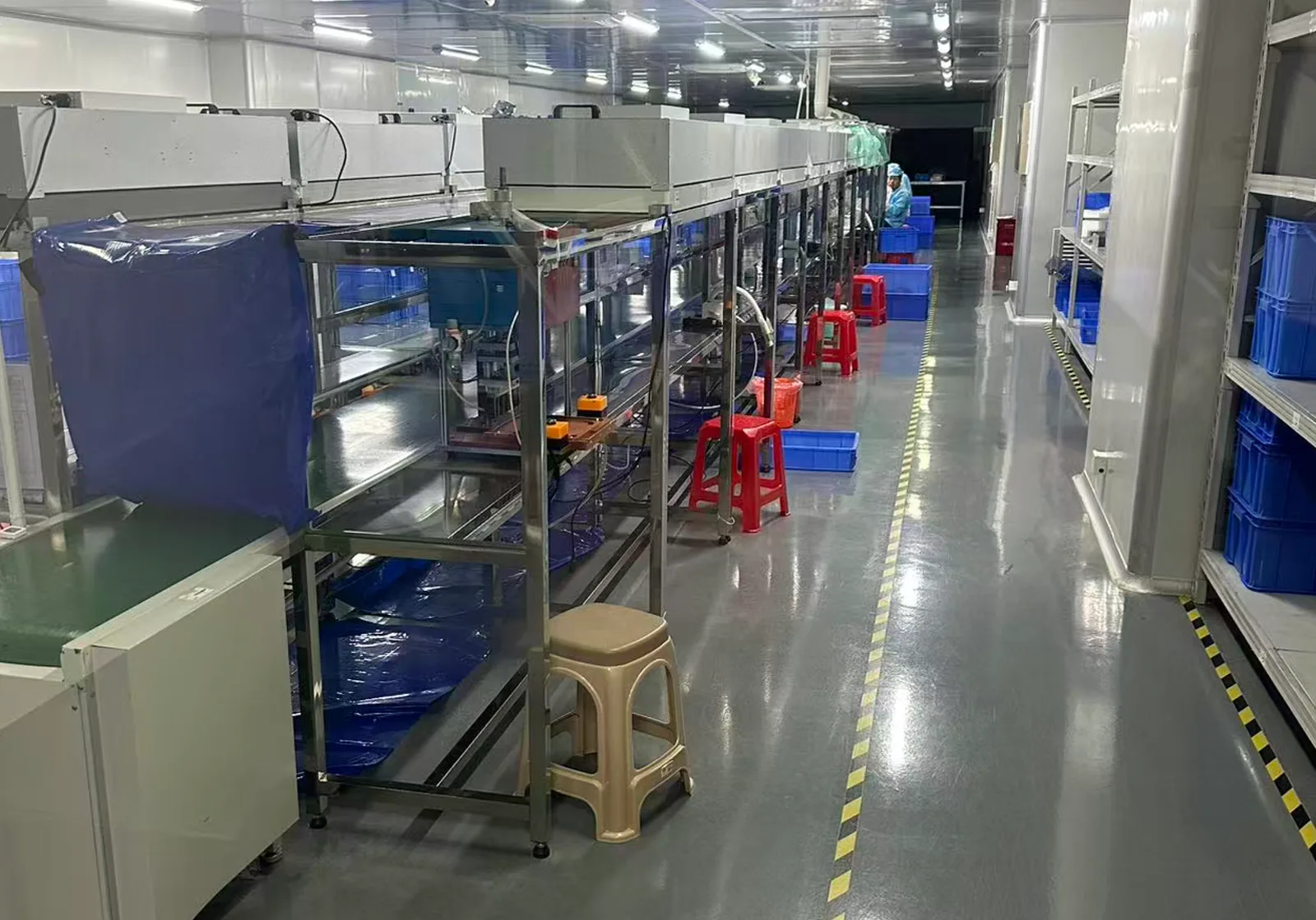
- Trading-company markups — buying factory-direct typically saves 40–60% (see our price analysis)
Send us the gallery plan and the interpretation brief — we'll return a phased hardware list with factory pricing.